
Core vs extended
Not every element is held to the same cross-platform bar. Pixel-identical Core+Extended everywhere is not possible — Adaptive Cards, Glance, and WidgetKit each miss overlays, live timers, or network fetch. Aim for a portable Core and treat Extended as best-effort.
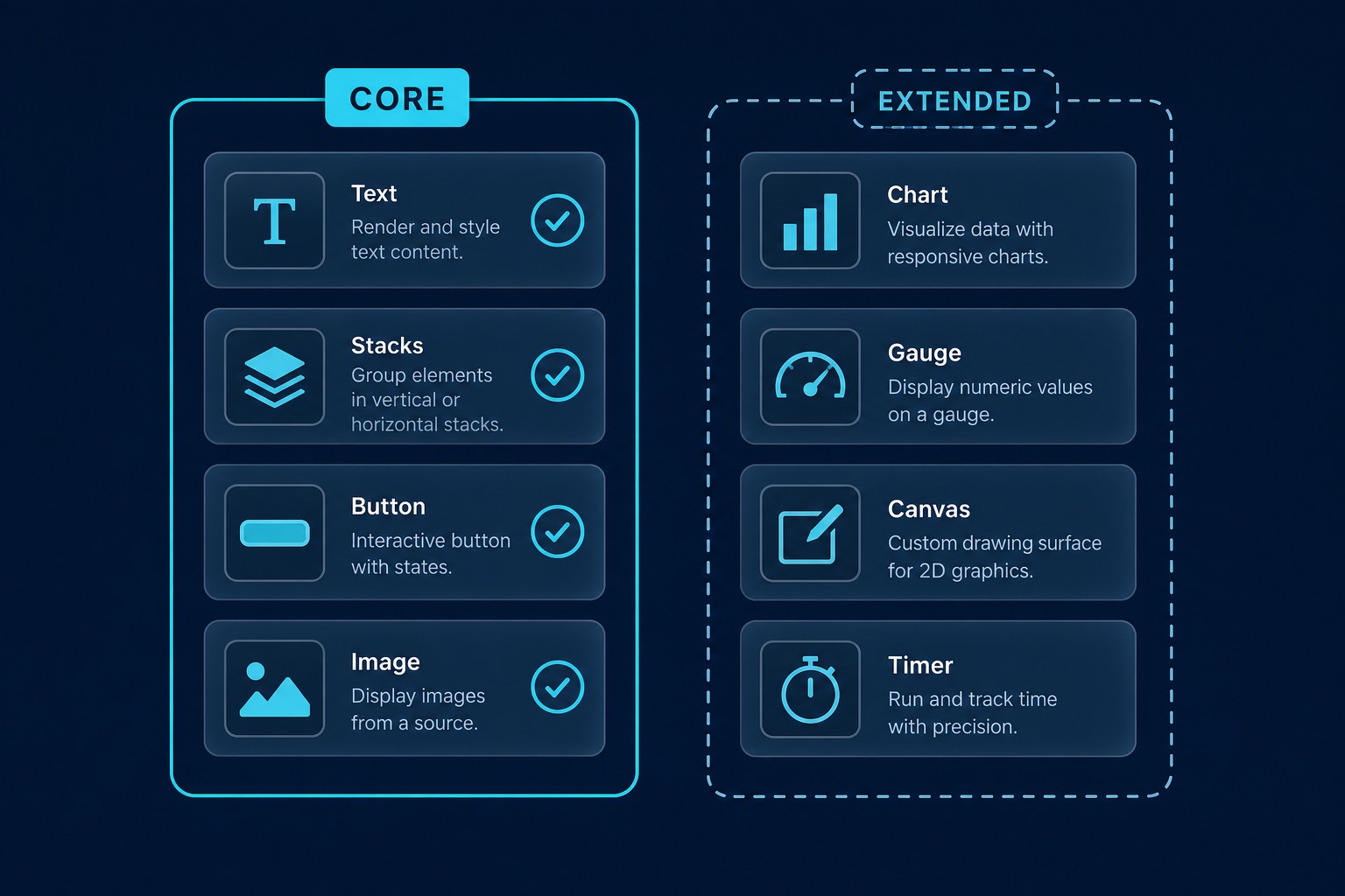
Core
Core means the element is present on every matrix platform and keeps its IR semantics (layout role, text, tap target, bitmap image, …). It does not mean identical pixels. Degraded cells (for example Windows zstack / shape, or image.systemName outside Apple) are documented in the matrix below — check them before assuming Board/Glance look like WidgetKit.
The authoritative list is CORE_ELEMENTS in src/snapshot.rs (also mirrored under Capability matrix). Prefer that set when you need broad coverage.
Portable Core checklist
- Prefer solid backgrounds (or accept gradient bake / first-stop degradation).
- Prefer
image.data/image.urloverimage.systemNamefor Board/Android parity — SF Symbols exist only on Apple; elsewhere the feature row is degraded (glyph/emoji). - Remote
image.urlis prefetched on the host where wired — do not rely on live network inside the extension process. - Prefer Desktop webview when you need true overlays, live timers, or full SVG canvas.
Extended
Extended (EXTENDED_ELEMENTS) is best-effort and platform-dependent. Expect degraded or unsupported cells (live timer on Windows Board, chart rasterization on Adaptive Cards). The live list is in the matrix section.
How to read the matrix
| Level | Meaning |
|---|---|
| full | Supported with the intended semantics |
| degraded | Renders with known limitations (see footnotes under the matrix) |
| unsupported | Do not rely on this feature on that platform |
Desktop column: one IR path shared by the desktop webview hosts — WKWebView (macOS window), WebView2 (Windows window), and webkit2gtk (Linux). Semantics match; differences are system fonts and CSS engine version. Linux also has its own golden stand (tests/golden/linux/) for pinning / layer-shell, but it is not a sixth matrix column. Windows Widgets Board (Adaptive Cards) is the separate Windows column.
Showcase presets exercise both tiers; docs build fails if a schema element has zero fixture coverage.
Runtime behavior
Capability warnings on setWidgetConfig
Each setWidgetConfig runs validate_config for the current host platform and emits log::warn! via log_capabilities when a used element or feature is degraded / unsupported (for example image.systemName outside Apple). Warnings are advisory — the write still proceeds. There is no public guest API to dry-run validation yet; treat host logs (and the matrix) as the source of truth before shipping a config.
Skipped elements in render receipts
When a renderer cannot express a node (common on Adaptive Cards without the rasterize feature, or after a flatten), the element is recorded on the render receipt as skipped: [{ type, reason }], not as a silent hole you must guess about.
Inspect recent receipts with getWidgetDiagnostics(group):
import { getWidgetDiagnostics } from "tauri-plugin-widgets-api";

const receipts = await getWidgetDiagnostics("com.example.widgets");
for (const r of receipts) {
  if (r.skipped?.length) {
    console.warn(r.widgetId, r.skipped);
    // e.g. [{ type: "canvas", reason: "adaptive-cards: enable crate feature `rasterize`" }]
  }
}
Desktop / debug builds can also use getWidgetTrace(group) for the host journal plus receipt history.
Capability matrix
Table is authored in src/capabilities.rs; this page embeds it automatically. Refresh with cargo test --lib capabilities::write_docs::capability_matrix_doc_matches (delete docs/guide/_generated/capability-matrix.md first if drifted) then pnpm docs:generate.
Element lists
Core (CORE_ELEMENTS in src/snapshot.rs): vstack, hstack, zstack, container, grid, text, image, spacer, divider, progress, button, link, shape
Extended (EXTENDED_ELEMENTS): gauge, toggle, date, chart, list, timer, canvas, label
Core
| Element | iOS | macOS | Android | Desktop | Windows |
|---|---|---|---|---|---|
vstack | full | full | full | full | full1 |
hstack | full | full | full | full | full1 |
zstack | full | full | full | full | degraded2 |
container | full | full | full | full | full1 |
grid | full | full | full | full | full1 |
text | full | full | full | full | full1 |
image | full | full | full3 | full | full4 |
spacer | full | full | full | full | full1 |
divider | full | full | full | full | full1 |
progress | full | full | full | full | full1 |
button | full | full | full | full | full1 |
link | full | full | full | full | full1 |
shape | full | full | full | full | degraded5 |
Extended
| Element | iOS | macOS | Android | Desktop | Windows |
|---|---|---|---|---|---|
gauge | full | full | full | full | degraded5 |
toggle | full | full | full | full | full1 |
date | full | full | full | full | full1 |
chart | full | full | full6 | full7 | degraded5 |
list | full | full | full8 | full | degraded9 |
timer | full | full | full10 | full11 | degraded12 |
canvas | full | full | degraded13 | full7 | degraded5 |
label | full | full | full | full | full1 |
Feature notes
| Feature | iOS | macOS | Android | Desktop | Windows |
|---|---|---|---|---|---|
image.url | full14 | full14 | full15 | full | full16 |
image.systemName | full17 | full17 | degraded18 | degraded18 | degraded19 |
background.gradient | full20 | full20 | full21 | full22 | degraded23 |
canvas.path | full24 | full24 | full25 | full26 | degraded27 |
timer.live | full28 | full28 | full10 | full29 | degraded30 |
Choosing a surface set
Pick the platforms you ship, then stay in the full set for that profile. Degraded cells still render, but check the Notes and element pages.
Apple only
Platforms: iOS + macOS.
- Full core:
vstack,hstack,zstack,container,grid,text,image,spacer,divider,progress,button,link,shape - Full extended:
gauge,toggle,date,chart,list,timer,canvas,label
Apple + Android
Platforms: iOS + macOS + Android.
- Full core:
vstack,hstack,zstack,container,grid,text,image,spacer,divider,progress,button,link,shape - Full extended:
gauge,toggle,date,chart,list,timer,label - Extended with degraded/unsupported cells:
canvas
All five matrix columns
Platforms: iOS + macOS + Android + Desktop + Windows.
- Full core:
vstack,hstack,container,grid,text,image,spacer,divider,progress,button,link - Core with degraded/unsupported cells:
zstack,shape - Full extended:
toggle,date,label - Extended with degraded/unsupported cells:
gauge,chart,list,timer,canvas
Notes
- Adaptive Cards 1.5
- rasterized PNG overlay when possible; else flattened Container
- url via localPath preprocess; see image.systemName
- url/data URI; see image.systemName
- rasterized PNG
- bitmap bar/line/area/pie
- SVG
- Column chunking; soft cap ~50 items
- Adaptive Cards Table
- Chronometer via AndroidRemoteViews
- setInterval
- provider minute push + static TextBlock
- bitmap canvas (full SVG path via PathParser)
- host prefetch to data URI on setWidgetConfig
- preprocess to localPath on setWidgetConfig
- Adaptive Cards Image.url
- SF Symbols
- SF→Material / emoji map (not SF Symbols)
- emoji TextBlock by default; glyph PNG Image with feature rasterize
- linear/radial/angular SwiftUI
- baked bitmap at LocalSize / frame
- linear/radial/angular CSS/SVG
- rasterized PNG backgroundImage when rasterize enabled
- SVG path grammar
- PathParser full SVG path
- SVG path
- rasterized via SVG
- Text(..., .timer)
- JS interval
- provider pushes UpdateWidget ~1/min