Data
Progress, gauges, charts, and lists.
progress
Tier: core
Linear or circular progress indicator.
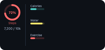
From showcase preset — case fitness.medium.
Properties
| Property | Type | Default | Description |
|---|---|---|---|
background | BackgroundValue | — | Solid, adaptive, or gradient background. |
barStyle | ProgressStyle | — | linear (default) or circular. |
border | BorderConfig | — | Border color and width. |
clipShape | ClipShape | — | Clip content to a shape (e.g. circle avatar from square image). |
color | ColorValue | — | Track / label color. |
cornerRadius | number | — | Corner radius in points. |
flex | number | — | Layout weight for flexible sizing inside stacks (like Android layout_weight). |
frame | FrameConfig | — | Explicit width / height / max constraints. |
label | string | — | Caption above the bar. Always set on Android so hosts never show null. |
opacity | number | — | Opacity from 0 (invisible) to 1 (opaque). |
padding | PaddingValue | — | Inset padding (number or per-edge object). |
shadow | ShadowConfig | — | Drop shadow. |
tint | ColorValue | — | Accent / fill color for the completed portion. |
total | number | 1 | Denominator for the ratio. Default 1.0. |
value | number | — | Current value. Clamped to 0..=total by renderers. |
Examples
Minimal
json
{
  "type": "progress",
  "value": 0.7,
  "total": 1,
  "tint": "#4CAF50",
  "color": "secondaryLabel",
  "label": "Humidity",
  "barStyle": "linear"
}
From showcase fitness.medium
json
{
  "type": "progress",
  "value": 0.45,
  "tint": "#4ecdc4",
  "label": "Calories",
  "color": "#94a3b8"
}
From showcase fitness.small
json
{
  "type": "progress",
  "value": 0.45,
  "tint": "#4ecdc4",
  "label": "Cal",
  "color": "#94a3b8"
}
Inside a WidgetConfig
json
{
  "small": {
    "type": "progress",
    "value": 0.7,
    "total": 1,
    "tint": "#4CAF50",
    "color": "secondaryLabel",
    "label": "Humidity",
    "barStyle": "linear"
  }
}
gauge
Tier: extended
Circular or capacity-style gauge.
From showcase preset — case fitness.medium.
Properties
| Property | Type | Default | Description |
|---|---|---|---|
background | BackgroundValue | — | Solid, adaptive, or gradient background. |
border | BorderConfig | — | Border color and width. |
clipShape | ClipShape | — | Clip content to a shape (e.g. circle avatar from square image). |
color | ColorValue | — | Secondary / track color. |
cornerRadius | number | — | Corner radius in points. |
currentValueLabel | string | — | Text shown for the current value (e.g. "72%"). |
flex | number | — | Layout weight for flexible sizing inside stacks (like Android layout_weight). |
frame | FrameConfig | — | Explicit width / height / max constraints. |
gaugeStyle | GaugeStyle | — | Visual style (e.g. circular). |
label | string | — | Optional caption. |
max | number | — | Upper bound. Default 1. |
min | number | — | Lower bound. Default 0. |
opacity | number | — | Opacity from 0 (invisible) to 1 (opaque). |
padding | PaddingValue | — | Inset padding (number or per-edge object). |
shadow | ShadowConfig | — | Drop shadow. |
tint | ColorValue | — | Accent color. |
value | number | — | Current value within [min, max]. |
Examples
Minimal
json
{
  "type": "gauge",
  "value": 0.72,
  "min": 0,
  "max": 1,
  "label": "CPU",
  "currentValueLabel": "72%",
  "tint": "#38bdf8",
  "gaugeStyle": "circular"
}
From showcase fitness.medium
json
{
  "type": "gauge",
  "value": 0.72,
  "min": 0,
  "max": 1,
  "currentValueLabel": "72%",
  "label": "Steps",
  "gaugeStyle": "circular",
  "tint": "#ff6b6b"
}
From showcase gauge-square.small
json
{
  "type": "gauge",
  "value": 0.72,
  "min": 0,
  "max": 1,
  "label": "CPU",
  "currentValueLabel": "72%",
  "tint": "#7aa2f7",
  "gaugeStyle": "circular"
}
Inside a WidgetConfig
json
{
  "small": {
    "type": "gauge",
    "value": 0.72,
    "min": 0,
    "max": 1,
    "label": "CPU",
    "currentValueLabel": "72%",
    "tint": "#38bdf8",
    "gaugeStyle": "circular"
  }
}
chart
Tier: extended
Bar, line, area, or pie chart.
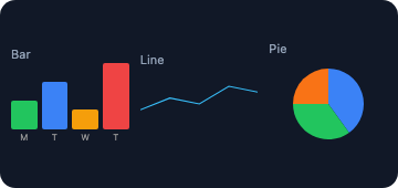
From showcase preset — case chart-mix.medium.
Properties
| Property | Type | Default | Description |
|---|---|---|---|
background | BackgroundValue | — | Solid, adaptive, or gradient background. |
border | BorderConfig | — | Border color and width. |
chartData | ChartDataPoint[] | — | Data points (label + value, optional per-point color). |
chartType | any | — | Chart kind: bar, line, area, or pie. |
clipShape | ClipShape | — | Clip content to a shape (e.g. circle avatar from square image). |
cornerRadius | number | — | Corner radius in points. |
flex | number | — | Layout weight for flexible sizing inside stacks (like Android layout_weight). |
frame | FrameConfig | — | Explicit width / height / max constraints. |
opacity | number | — | Opacity from 0 (invisible) to 1 (opaque). |
padding | PaddingValue | — | Inset padding (number or per-edge object). |
shadow | ShadowConfig | — | Drop shadow. |
tint | ColorValue | — | Default series tint. |
Examples
Minimal
json
{
  "type": "chart",
  "chartType": "bar",
  "tint": "#38bdf8",
  "chartData": [
    {
      "label": "Mon",
      "value": 120
    },
    {
      "label": "Tue",
      "value": 90
    },
    {
      "label": "Wed",
      "value": 150
    }
  ]
}
From showcase chart-mix.medium
json
{
  "type": "chart",
  "chartType": "bar",
  "tint": "#22c55e",
  "chartData": [
    {
      "label": "M",
      "value": 3,
      "color": "#22c55e"
    },
    {
      "label": "T",
      "value": 5,
      "color": "#3b82f6"
    },
    {
      "label": "W",
      "value": 2,
      "color": "#f59e0b"
    },
    {
      "label": "T",
      "value": 7,
      "color": "#ef4444"
    }
  ]
}
From showcase stress-nest.large
json
{
  "type": "chart",
  "chartType": "bar",
  "flex": 1,
  "tint": "#38bdf8",
  "chartData": [
    {
      "label": "a",
      "value": 2,
      "color": "#38bdf8"
    },
    {
      "label": "b",
      "value": 5,
      "color": "#818cf8"
    },
    {
      "label": "c",
      "value": 1,
      "color": "#c084fc"
    },
    {
      "label": "d",
      "value": 7,
      "color": "#f472b6"
    },
    {
      "label": "e",
      "value": 4,
      "color": "#fb7185"
    }
  ]
}
Inside a WidgetConfig
json
{
  "small": {
    "type": "chart",
    "chartType": "bar",
    "tint": "#38bdf8",
    "chartData": [
      {
        "label": "Mon",
        "value": 120
      },
      {
        "label": "Tue",
        "value": 90
      },
      {
        "label": "Wed",
        "value": 150
      }
    ]
  }
}
list
Tier: extended
Collection list of rows (text, optional checked marker and action).
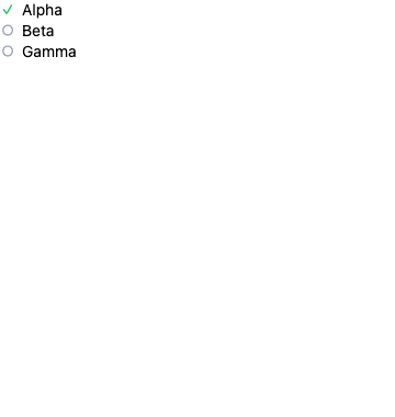
From showcase preset — case android-list.large.
Properties
| Property | Type | Default | Description |
|---|---|---|---|
background | BackgroundValue | — | Solid, adaptive, or gradient background. |
border | BorderConfig | — | Border color and width. |
children | WidgetElement[] | — | Rich rows as nested elements (alternative to typed [ListItem]s). |
clipShape | ClipShape | — | Clip content to a shape (e.g. circle avatar from square image). |
color | ColorValue | — | Row text color. |
cornerRadius | number | — | Corner radius in points. |
flex | number | — | Layout weight for flexible sizing inside stacks (like Android layout_weight). |
fontSize | number | — | Row text font size. |
frame | FrameConfig | — | Explicit width / height / max constraints. |
items | ListItem[] | — | Row items. |
opacity | number | — | Opacity from 0 (invisible) to 1 (opaque). |
padding | PaddingValue | — | Inset padding (number or per-edge object). |
shadow | ShadowConfig | — | Drop shadow. |
spacing | number | — | Space between rows (points). |
Examples
Minimal
json
{
  "type": "list",
  "spacing": 4,
  "fontSize": 14,
  "items": [
    {
      "text": "Alpha",
      "checked": true,
      "action": "row",
      "payload": "a"
    },
    {
      "text": "Beta",
      "checked": false,
      "action": "row",
      "payload": "b"
    },
    {
      "text": "Gamma"
    }
  ]
}
From showcase android-list.large (size root)
json
{
  "type": "list",
  "items": [
    {
      "text": "Alpha",
      "checked": true,
      "action": "row",
      "payload": "a"
    },
    {
      "text": "Beta",
      "checked": false,
      "action": "row",
      "payload": "b"
    },
    {
      "text": "Gamma"
    }
  ],
  "spacing": 2,
  "fontSize": 14
}
From showcase list-20-items.large (size root)
json
{
  "type": "list",
  "spacing": 2,
  "fontSize": 12,
  "color": "#e2e8f0",
  "background": "#0f172a",
  "padding": 8,
  "items": [
    {
      "text": "Item 01",
      "checked": false
    },
    {
      "text": "Item 02",
      "checked": true
    },
    {
      "text": "Item 03"
    },
    {
      "text": "Item 04"
    }
  ]
}
Inside a WidgetConfig
json
{
  "small": {
    "type": "list",
    "spacing": 4,
    "fontSize": 14,
    "items": [
      {
        "text": "Alpha",
        "checked": true,
        "action": "row",
        "payload": "a"
      },
      {
        "text": "Beta",
        "checked": false,
        "action": "row",
        "payload": "b"
      },
      {
        "text": "Gamma"
      }
    ]
  }
}