Text
Typography and time display.
text
Tier: core
Text label with optional semantic typography.
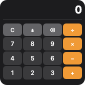
From showcase preset — case calculator.small.
Properties
| Property | Type | Default | Description |
|---|---|---|---|
alignment | TextAlignment | — | Text alignment within the line. |
background | BackgroundValue | — | Solid, adaptive, or gradient background. |
border | BorderConfig | — | Border color and width. |
clipShape | ClipShape | — | Clip content to a shape (e.g. circle avatar from square image). |
color | ColorValue | — | Text color. |
content | string | — | String to display. |
cornerRadius | number | — | Corner radius in points. |
flex | number | — | Layout weight for flexible sizing inside stacks (like Android layout_weight). |
fontDesign | FontDesign | — | Font design (default, monospaced, rounded, serif). |
fontSize | number | — | Font size in points (overridden by textStyle when set). |
fontWeight | FontWeight | — | Font weight. |
frame | FrameConfig | — | Explicit width / height / max constraints. |
lineLimit | integer | — | Maximum number of lines before truncation. |
opacity | number | — | Opacity from 0 (invisible) to 1 (opaque). |
padding | PaddingValue | — | Inset padding (number or per-edge object). |
shadow | ShadowConfig | — | Drop shadow. |
textStyle | TextStyle | — | Semantic text style (uses Dynamic Type on Apple, sp on Android). Overrides fontSize when set. |
Examples
Minimal
json
{
  "type": "text",
  "content": "Hello",
  "fontSize": 16,
  "fontWeight": "semibold",
  "color": {
    "light": "#0f172a",
    "dark": "#f8fafc"
  },
  "alignment": "leading",
  "lineLimit": 2
}
From showcase calculator.small
json
{
  "type": "text",
  "content": " ",
  "fontSize": 10,
  "color": "#f09a36",
  "alignment": "leading",
  "lineLimit": 1
}
From showcase chart-mix.medium
json
{
  "type": "text",
  "content": "Bar",
  "fontSize": 11,
  "color": "#94a3b8"
}
Inside a WidgetConfig
json
{
  "small": {
    "type": "text",
    "content": "Hello",
    "fontSize": 16,
    "fontWeight": "semibold",
    "color": {
      "light": "#0f172a",
      "dark": "#f8fafc"
    },
    "alignment": "leading",
    "lineLimit": 2
  }
}
label
Tier: extended
Convenience element combining an SF Symbol / icon with text.
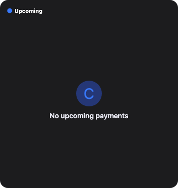
From showcase preset — case upcoming-payments-empty.large.
Properties
| Property | Type | Default | Description |
|---|---|---|---|
background | BackgroundValue | — | Solid, adaptive, or gradient background. |
border | BorderConfig | — | Border color and width. |
clipShape | ClipShape | — | Clip content to a shape (e.g. circle avatar from square image). |
color | ColorValue | — | Text color. |
cornerRadius | number | — | Corner radius in points. |
flex | number | — | Layout weight for flexible sizing inside stacks (like Android layout_weight). |
fontSize | number | — | Text font size. |
fontWeight | FontWeight | — | Text font weight. |
frame | FrameConfig | — | Explicit width / height / max constraints. |
iconColor | ColorValue | — | Icon tint color. |
opacity | number | — | Opacity from 0 (invisible) to 1 (opaque). |
padding | PaddingValue | — | Inset padding (number or per-edge object). |
shadow | ShadowConfig | — | Drop shadow. |
spacing | number | — | Space between icon and text. |
systemName | string | — | SF Symbol or platform icon name. |
text | string | — | Label text. |
Examples
Minimal
json
{
  "type": "label",
  "text": "Inbox",
  "systemName": "envelope.fill",
  "iconColor": "#38bdf8",
  "fontSize": 15,
  "fontWeight": "medium",
  "spacing": 6
}
From showcase upcoming-payments-empty.large
json
{
  "type": "label",
  "text": "Upcoming",
  "systemName": "calendar.badge.clock",
  "fontSize": 11,
  "fontWeight": "bold",
  "color": "label",
  "iconColor": "#3878FA",
  "spacing": 4
}
Inside a WidgetConfig
json
{
  "small": {
    "type": "label",
    "text": "Inbox",
    "systemName": "envelope.fill",
    "iconColor": "#38bdf8",
    "fontSize": 15,
    "fontWeight": "medium",
    "spacing": 6
  }
}
date
Tier: extended
Formatted date / relative time display.
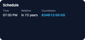
From showcase preset — case date-timer.medium.
Properties
| Property | Type | Default | Description |
|---|---|---|---|
background | BackgroundValue | — | Solid, adaptive, or gradient background. |
border | BorderConfig | — | Border color and width. |
clipShape | ClipShape | — | Clip content to a shape (e.g. circle avatar from square image). |
color | ColorValue | — | Text color. |
cornerRadius | number | — | Corner radius in points. |
date | string | — | ISO 8601 date string. |
dateStyle | DateStyle | — | Display style (time, date, relative, offset, timer). |
flex | number | — | Layout weight for flexible sizing inside stacks (like Android layout_weight). |
fontSize | number | — | Font size in points. |
frame | FrameConfig | — | Explicit width / height / max constraints. |
opacity | number | — | Opacity from 0 (invisible) to 1 (opaque). |
padding | PaddingValue | — | Inset padding (number or per-edge object). |
shadow | ShadowConfig | — | Drop shadow. |
Examples
Minimal
json
{
  "type": "date",
  "date": "2026-03-01T10:00:00Z",
  "dateStyle": "relative",
  "fontSize": 14,
  "color": "secondaryLabel"
}
From showcase date-timer.medium
json
{
  "type": "date",
  "date": "2099-06-15T14:30:00Z",
  "dateStyle": "time",
  "fontSize": 14,
  "color": "#e2e8f0"
}
Inside a WidgetConfig
json
{
  "small": {
    "type": "date",
    "date": "2026-03-01T10:00:00Z",
    "dateStyle": "relative",
    "fontSize": 14,
    "color": "secondaryLabel"
  }
}
timer
Tier: extended
Live countdown/countup timer that updates without timeline refresh.
From showcase preset — case date-timer.medium.
Properties
| Property | Type | Default | Description |
|---|---|---|---|
background | BackgroundValue | — | Solid, adaptive, or gradient background. |
border | BorderConfig | — | Border color and width. |
clipShape | ClipShape | — | Clip content to a shape (e.g. circle avatar from square image). |
color | ColorValue | — | Text color. |
cornerRadius | number | — | Corner radius in points. |
counting | TimerCounting | — | Count direction. Default: down. |
flex | number | — | Layout weight for flexible sizing inside stacks (like Android layout_weight). |
fontSize | number | — | Font size in points. |
fontWeight | FontWeight | — | Font weight. |
frame | FrameConfig | — | Explicit width / height / max constraints. |
opacity | number | — | Opacity from 0 (invisible) to 1 (opaque). |
padding | PaddingValue | — | Inset padding (number or per-edge object). |
shadow | ShadowConfig | — | Drop shadow. |
targetDate | string | — | ISO 8601 target date. |
Examples
Minimal
json
{
  "type": "timer",
  "targetDate": "2026-12-31T23:59:59Z",
  "counting": "down",
  "fontSize": 22,
  "fontWeight": "bold",
  "color": "#22c55e"
}
From showcase date-timer.medium
json
{
  "type": "timer",
  "targetDate": "2099-01-01T00:00:00Z",
  "counting": "down",
  "fontSize": 14,
  "fontWeight": "semibold",
  "color": "#38bdf8"
}
Inside a WidgetConfig
json
{
  "small": {
    "type": "timer",
    "targetDate": "2026-12-31T23:59:59Z",
    "counting": "down",
    "fontSize": 22,
    "fontWeight": "bold",
    "color": "#22c55e"
  }
}