
Media
Images, shapes, and declarative canvas.
image
Tier: core
Image from SF Symbol / drawable name, base64 data, or URL.

From showcase preset — case image-sources.medium.
Properties
| Property | Type | Default | Description |
|---|---|---|---|
background | BackgroundValue | — | Solid, adaptive, or gradient background. |
border | BorderConfig | — | Border color and width. |
clipShape | ClipShape | — | Clip content to a shape (e.g. circle avatar from square image). |
color | ColorValue | — | Tint color for template / symbol images. |
contentMode | ContentMode | — | How the image fills its frame (fit or fill). |
cornerRadius | number | — | Corner radius in points. |
data | string | — | Base64-encoded image data (with or without data:image/...;base64, prefix). |
flex | number | — | Layout weight for flexible sizing inside stacks (like Android layout_weight). |
frame | FrameConfig | — | Explicit width / height / max constraints. |
opacity | number | — | Opacity from 0 (invisible) to 1 (opaque). |
padding | PaddingValue | — | Inset padding (number or per-edge object). |
shadow | ShadowConfig | — | Drop shadow. |
size | number | — | Display size in points. |
systemName | string | — | SF Symbol name (Apple) or Material / drawable name (Android). |
url | string | — | Remote image URL (platform support varies — see capability matrix). |
Examples
Minimal
json
{
  "type": "image",
  "systemName": "cloud.sun.fill",
  "size": 28,
  "color": "#ffcc00",
  "contentMode": "fit"
}
From showcase image-sources.medium
json
{
  "type": "image",
  "systemName": "star.fill",
  "size": 32,
  "color": "#fbbf24"
}
From showcase link-chip.small
json
{
  "type": "image",
  "systemName": "gear",
  "size": 14,
  "color": "#38bdf8"
}
Inside a WidgetConfig
json
{
  "small": {
    "type": "image",
    "systemName": "cloud.sun.fill",
    "size": 28,
    "color": "#ffcc00",
    "contentMode": "fit"
  }
}
shape
Tier: core
Colored shape — circle, capsule, or rectangle.
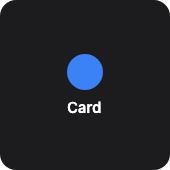
From showcase preset — case container-card.small.
Properties
| Property | Type | Default | Description |
|---|---|---|---|
background | BackgroundValue | — | Solid, adaptive, or gradient background. |
border | BorderConfig | — | Border color and width. |
clipShape | ClipShape | — | Clip content to a shape (e.g. circle avatar from square image). |
cornerRadius | number | — | Corner radius in points. |
fill | ColorValue | — | Fill color. |
flex | number | — | Layout weight for flexible sizing inside stacks (like Android layout_weight). |
frame | FrameConfig | — | Explicit width / height / max constraints. |
opacity | number | — | Opacity from 0 (invisible) to 1 (opaque). |
padding | PaddingValue | — | Inset padding (number or per-edge object). |
shadow | ShadowConfig | — | Drop shadow. |
shapeType | any | — | Shape kind. |
size | number | — | Bounding size in points. |
stroke | ColorValue | — | Stroke color. |
strokeWidth | number | — | Stroke width in points. |
Examples
Minimal
json
{
  "type": "shape",
  "shapeType": "capsule",
  "fill": "#ef4444",
  "size": 12,
  "stroke": "#fff",
  "strokeWidth": 1
}
From showcase container-card.small
json
{
  "type": "shape",
  "shapeType": "circle",
  "size": 36,
  "fill": "#3b82f6"
}
From showcase flex-stroke-grid.medium
json
{
  "type": "shape",
  "shapeType": "rectangle",
  "size": 36,
  "fill": "#1e293b",
  "stroke": "#22c55e",
  "strokeWidth": 2,
  "cornerRadius": 8,
  "flex": 1
}
Inside a WidgetConfig
json
{
  "small": {
    "type": "shape",
    "shapeType": "capsule",
    "fill": "#ef4444",
    "size": 12,
    "stroke": "#fff",
    "strokeWidth": 1
  }
}
canvas
Tier: extended
Declarative canvas — draw arbitrary shapes via JSON commands.
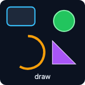
From showcase preset — case canvas-draws.small.
Properties
| Property | Type | Default | Description |
|---|---|---|---|
background | BackgroundValue | — | Solid, adaptive, or gradient background. |
border | BorderConfig | — | Border color and width. |
clipShape | ClipShape | — | Clip content to a shape (e.g. circle avatar from square image). |
cornerRadius | number | — | Corner radius in points. |
elements | CanvasDrawCommand[] | — | Draw commands (circle, line, rect, arc, text, path). |
flex | number | — | Layout weight for flexible sizing inside stacks (like Android layout_weight). |
frame | FrameConfig | — | Explicit width / height / max constraints. |
height | number | — | Canvas height in points. |
opacity | number | — | Opacity from 0 (invisible) to 1 (opaque). |
padding | PaddingValue | — | Inset padding (number or per-edge object). |
shadow | ShadowConfig | — | Drop shadow. |
width | number | — | Canvas width in points. |
Examples
Minimal
json
{
  "type": "canvas",
  "width": 80,
  "height": 80,
  "background": "#0f172a",
  "cornerRadius": 12,
  "elements": [
    {
      "draw": "circle",
      "cx": 40,
      "cy": 40,
      "r": 28,
      "fill": "#1e293b",
      "stroke": "#38bdf8",
      "strokeWidth": 2
    },
    {
      "draw": "text",
      "x": 40,
      "y": 44,
      "content": "72",
      "fontSize": 18,
      "color": "#fff",
      "anchor": "middle"
    }
  ]
}
From showcase canvas-draws.small (size root)
json
{
  "type": "canvas",
  "width": 146,
  "height": 146,
  "background": "#0b1220",
  "cornerRadius": 12,
  "elements": [
    {
      "draw": "rect",
      "x": 12,
      "y": 12,
      "width": 48,
      "height": 32,
      "fill": "#1e293b",
      "stroke": "#38bdf8",
      "strokeWidth": 2,
      "cornerRadius": 6
    },
    {
      "draw": "circle",
      "cx": 110,
      "cy": 36,
      "r": 18,
      "fill": "#22c55e",
      "stroke": "#86efac",
      "strokeWidth": 2
    },
    {
      "draw": "arc",
      "cx": 48,
      "cy": 90,
      "r": 28,
      "startAngle": -90,
      "endAngle": 120,
      "stroke": "#f59e0b",
      "strokeWidth": 4
    },
    {
      "draw": "path",
      "d": "M90 70 L130 110 L90 110 Z",
      "fill": "#a855f7",
      "stroke": "#e9d5ff",
      "strokeWidth": 1
    },
    {
      "draw": "text",
      "x": 73,
      "y": 136,
      "content": "draw",
      "fontSize": 12,
      "color": "#e2e8f0",
      "anchor": "middle"
    }
  ]
}
From showcase canvas-scale.small
json
{
  "type": "canvas",
  "width": 60,
  "height": 60,
  "elements": [
    {
      "draw": "circle",
      "cx": 30,
      "cy": 30,
      "r": 25,
      "fill": "#1e40af",
      "stroke": "#fff",
      "strokeWidth": 2
    },
    {
      "draw": "line",
      "x1": 30,
      "y1": 30,
      "x2": 30,
      "y2": 10,
      "stroke": "#fff",
      "strokeWidth": 2
    }
  ]
}
Inside a WidgetConfig
json
{
  "small": {
    "type": "canvas",
    "width": 80,
    "height": 80,
    "background": "#0f172a",
    "cornerRadius": 12,
    "elements": [
      {
        "draw": "circle",
        "cx": 40,
        "cy": 40,
        "r": 28,
        "fill": "#1e293b",
        "stroke": "#38bdf8",
        "strokeWidth": 2
      },
      {
        "draw": "text",
        "x": 40,
        "y": 44,
        "content": "72",
        "fontSize": 18,
        "color": "#fff",
        "anchor": "middle"
      }
    ]
  }
}