
Spacing
Spacers and dividers.
spacer
Tier: core
Flexible empty space.
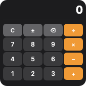
From showcase preset — case calculator.small.
Properties
| Property | Type | Default | Description |
|---|---|---|---|
minLength | number | — | Minimum length along the parent axis (points). |
Examples
Minimal
json
{
  "type": "spacer",
  "minLength": 8
}
From showcase calculator.small
json
{
  "type": "spacer"
}
From showcase upcoming-payments.large
json
{
  "type": "spacer",
  "minLength": 4
}
Inside a WidgetConfig
json
{
  "small": {
    "type": "spacer",
    "minLength": 8
  }
}
divider
Tier: core
Horizontal or vertical rule.
From showcase preset — case calculator.small.
Properties
| Property | Type | Default | Description |
|---|---|---|---|
background | BackgroundValue | — | Solid, adaptive, or gradient background. |
border | BorderConfig | — | Border color and width. |
clipShape | ClipShape | — | Clip content to a shape (e.g. circle avatar from square image). |
color | ColorValue | — | Line color. |
cornerRadius | number | — | Corner radius in points. |
flex | number | — | Layout weight for flexible sizing inside stacks (like Android layout_weight). |
frame | FrameConfig | — | Explicit width / height / max constraints. |
opacity | number | — | Opacity from 0 (invisible) to 1 (opaque). |
padding | PaddingValue | — | Inset padding (number or per-edge object). |
shadow | ShadowConfig | — | Drop shadow. |
thickness | number | — | Line thickness in points. |
Examples
Minimal
json
{
  "type": "divider",
  "thickness": 1,
  "color": "separator"
}
From showcase calculator.small
json
{
  "type": "divider",
  "color": "#3a3a3c",
  "thickness": 1
}
From showcase fitness.medium
json
{
  "type": "divider",
  "color": "#334155"
}
Inside a WidgetConfig
json
{
  "small": {
    "type": "divider",
    "thickness": 1,
    "color": "separator"
  }
}