Interactive
Buttons, toggles, and tappable wrappers.
button
Tier: core
Tappable button that opens a URL or emits widget-action.
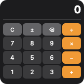
From showcase preset — case calculator.small.
Properties
| Property | Type | Default | Description |
|---|---|---|---|
action | string | — | Action identifier — emits a widget-action Tauri event when tapped. |
background | BackgroundValue | — | Solid, adaptive, or gradient background. |
backgroundColor | ColorValue | — | Button background color. |
border | BorderConfig | — | Border color and width. |
clipShape | ClipShape | — | Clip content to a shape (e.g. circle avatar from square image). |
color | ColorValue | — | Label text color. |
cornerRadius | number | — | Corner radius in points. |
flex | number | — | Layout weight for flexible sizing inside stacks (like Android layout_weight). |
fontSize | number | — | Label font size in points. |
frame | FrameConfig | — | Explicit width / height / max constraints. |
label | string | — | Button label text. |
opacity | number | — | Opacity from 0 (invisible) to 1 (opaque). |
padding | PaddingValue | — | Inset padding (number or per-edge object). |
shadow | ShadowConfig | — | Drop shadow. |
textAlignment | TextAlignment | — | Label text alignment. |
url | string | — | Deep link URL to open the app (used when no action is set). |
Examples
Minimal
json
{
  "type": "button",
  "label": "Refresh",
  "action": "refresh",
  "color": "#fff",
  "backgroundColor": "#0284c7",
  "fontSize": 14,
  "cornerRadius": 10
}
From showcase calculator.small
json
{
  "type": "button",
  "label": "C",
  "action": "calc:C",
  "backgroundColor": "#636366",
  "color": "#fff",
  "fontSize": 10,
  "cornerRadius": 6,
  "padding": {
    "top": 1,
    "bottom": 1,
    "leading": 2,
    "trailing": 2
  }
}
From showcase layout.small
json
{
  "type": "button",
  "label": "Go",
  "action": "go",
  "backgroundColor": "#2196F3",
  "color": "#fff"
}
Inside a WidgetConfig
json
{
  "small": {
    "type": "button",
    "label": "Refresh",
    "action": "refresh",
    "color": "#fff",
    "backgroundColor": "#0284c7",
    "fontSize": 14,
    "cornerRadius": 10
  }
}
toggle
Tier: extended
On/off toggle control.
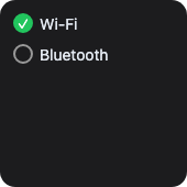
From showcase preset — case toggle-row.small.
Properties
| Property | Type | Default | Description |
|---|---|---|---|
action | string | — | Action identifier sent back to the app. |
background | BackgroundValue | — | Solid, adaptive, or gradient background. |
border | BorderConfig | — | Border color and width. |
clipShape | ClipShape | — | Clip content to a shape (e.g. circle avatar from square image). |
cornerRadius | number | — | Corner radius in points. |
flex | number | — | Layout weight for flexible sizing inside stacks (like Android layout_weight). |
frame | FrameConfig | — | Explicit width / height / max constraints. |
isOn | boolean | — | Whether the toggle is on. |
label | string | — | Optional label beside the control. |
opacity | number | — | Opacity from 0 (invisible) to 1 (opaque). |
padding | PaddingValue | — | Inset padding (number or per-edge object). |
shadow | ShadowConfig | — | Drop shadow. |
tint | ColorValue | — | Accent color when on. |
Examples
Minimal
json
{
  "type": "toggle",
  "isOn": true,
  "label": "Dark mode",
  "tint": "#38bdf8",
  "action": "toggle-dark"
}
From showcase stress-nest.large
json
{
  "type": "toggle",
  "isOn": true,
  "action": "stress_toggle"
}
From showcase toggle-row.small
json
{
  "type": "toggle",
  "isOn": true,
  "label": "Wi-Fi",
  "tint": "#22c55e",
  "color": "#e2e8f0",
  "action": "toggle_wifi"
}
Inside a WidgetConfig
json
{
  "small": {
    "type": "toggle",
    "isOn": true,
    "label": "Dark mode",
    "tint": "#38bdf8",
    "action": "toggle-dark"
  }
}
link
Tier: core
Tappable wrapper — makes nested content clickable.
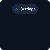
From showcase preset — case link-chip.small.
Properties
| Property | Type | Default | Description |
|---|---|---|---|
action | string | — | Action identifier — emits widget-action event. |
background | BackgroundValue | — | Solid, adaptive, or gradient background. |
border | BorderConfig | — | Border color and width. |
children | WidgetElement[] | — | Nested content to wrap. |
clipShape | ClipShape | — | Clip content to a shape (e.g. circle avatar from square image). |
cornerRadius | number | — | Corner radius in points. |
flex | number | — | Layout weight for flexible sizing inside stacks (like Android layout_weight). |
frame | FrameConfig | — | Explicit width / height / max constraints. |
opacity | number | — | Opacity from 0 (invisible) to 1 (opaque). |
padding | PaddingValue | — | Inset padding (number or per-edge object). |
shadow | ShadowConfig | — | Drop shadow. |
url | string | — | Deep-link URL to open. |
Examples
Minimal
json
{
  "type": "link",
  "action": "open-details",
  "payload": "item-1",
  "children": [
    {
      "type": "hstack",
      "spacing": 6,
      "alignment": "center",
      "children": [
        {
          "type": "text",
          "content": "Details",
          "color": "#38bdf8",
          "fontWeight": "medium"
        },
        {
          "type": "image",
          "systemName": "chevron.right",
          "size": 12,
          "color": "#38bdf8"
        }
      ]
    }
  ]
}
From showcase link-chip.small
json
{
  "type": "link",
  "action": "open_settings",
  "padding": 8,
  "cornerRadius": 999,
  "background": "#1e293b",
  "children": [
    {
      "type": "hstack",
      "spacing": 6,
      "alignment": "center",
      "children": [
        {
          "type": "image",
          "systemName": "gear",
          "size": 14,
          "color": "#38bdf8"
        },
        {
          "type": "text",
          "content": "Settings",
          "fontSize": 13,
          "fontWeight": "medium",
          "color": "#e2e8f0"
        }
      ]
    }
  ]
}
From showcase stress-nest.large
json
{
  "type": "link",
  "action": "open_settings",
  "padding": 8,
  "cornerRadius": 8,
  "background": "#334155",
  "children": [
    {
      "type": "text",
      "content": "Link",
      "fontSize": 12,
      "color": "#38bdf8"
    }
  ]
}
Inside a WidgetConfig
json
{
  "small": {
    "type": "link",
    "action": "open-details",
    "payload": "item-1",
    "children": [
      {
        "type": "hstack",
        "spacing": 6,
        "alignment": "center",
        "children": [
          {
            "type": "text",
            "content": "Details",
            "color": "#38bdf8",
            "fontWeight": "medium"
          },
          {
            "type": "image",
            "systemName": "chevron.right",
            "size": 12,
            "color": "#38bdf8"
          }
        ]
      }
    ]
  }
}